Introduction
You can easily add interactive introductions or step by step guides to your Wisej applications with our TourPanel extension.
The extension is included in the Wisej installer and the full source code is available online at https://www.wisej.com/extensions where you can also find a growing list of other useful and cool extensions.
See our TourPanel extension in action:
Getting started
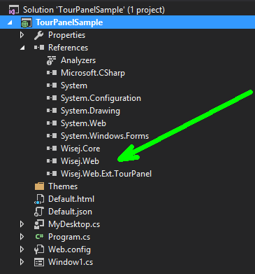
To add tour features to your application you first need to add a reference to the TourPanel extension:
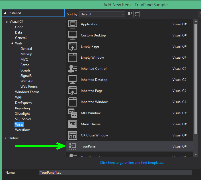
Next you add a New Item to your project and choose the TourPanel template:
A new TourPanel window will be added and this is how it looks like in the Visual Studio designer:
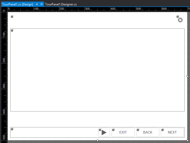
Please note that this window can be customized and designed like any other window in Visual Studio. We will share some details in this article and also explain the most important properties.
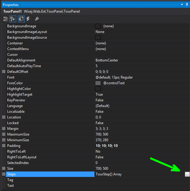
One of those properties is a collection of TourSteps that can be edited through the property window:
Clicking on the … button opens the TourStep Collection Editor where you add/remove/edit steps and also change the order of your steps:
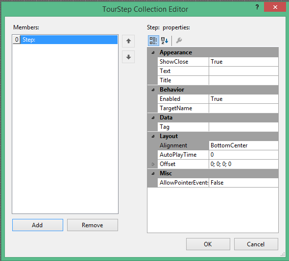
Lets take a closer look at the TourStep properties:
ShowClose If TRUE an X is shown allowing the user to close/cancel the tour
Text The text that is shown in the multiline textbox (HTML can be used)
Title The title of the step, shown in the title bar
Enabled If FALSE, the step is skipped from the Tour
TargetName Name of the Control that is highlighted. Syntax will be explained below
Tag A user tag that you can attach to a step
Alignment Controls where the TourPanel window “docks” at the target control
AutoPlayTime Individual time interval that is used for that step when auto played
Offset Offset that is added before docking the TourPanel window to the target control
AllowPointerEvents Controls if you can click/point/tap on target Control
To identify a control that is going to be highlighted in a TourStep you define the TargetName with fully qualifying path syntax.
That means if you want to address a child button1 of a panel1 you would use panel1.button1.
Child widgets (widgets that compose more complex widgets) can be reached using the slash separator and the name of the child widget.
For example tools added to a control can be reached with textbox1/tools.
Child widgets that are part of the children collection on the client can be reached using the [] syntax.
For example the first tool in a tools widget is addressable as textbox1/tools[0].
This blog will list a couple of examples for different addressing syntaxes.
At runtime, when a TargetName path is resolved to address a control, various build in actions are executed automatically.
If the path is a nested path including multiple controls, those actions will be executed on every control! They ensure that the referenced control is actually displayed.
Control type Action
Group Box Expand
Accordion Panel Expand
Panel Expand
Tab Page Select
Form Activate
DGV column Scroll into view
Listview Column Header Scroll into view
Default Show / Scroll into view
For example if you have a path like form1.datagridview1.column1 it first activates the form and then the column is scrolled into view.
We have put a sample application together that covers most of the TourPanel features. You can find the links to run it or to download the source code at the end of this blog article.
Tour panel window
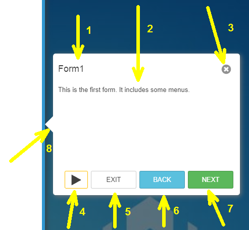
This is how the tour panel window appears at runtime. It´s the default design that can be fully customized using the Visual Studio designer. Additionally it is themeable and localizable.
It contains the following elements:
Customization ideas
Some possible customizations you might add to “your” Tour Panel window are
Sample App
Lets take a closer look at the sample. It shows how to use the TargetName to address controls, how to handle various events and the usage of several properties.
Step 0 – Desktop toolbar
Address the desktop toolbar with TargetName = Desktop.toolbar1
Step 1 – Form1
Form1 will be activated / brought to top
Step 2 – Help menu
Step 3 – File menu
Shows how to address menu items in a windows menu
Step4 – First Name
Step5 – Name
Shows how you can change HighlightColor and BackColor and add an additional text for required fields.
See following code added to the BeforeStep event handler:
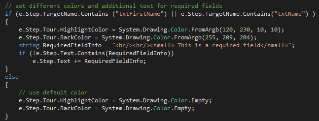
Setting the colors back to ColorEmpty makes the TourPanel use the colors defined in the Theme for all other steps.
Step6 – cmbInterest
Step7 – Tool in cmbInterest
Use TargetName = Window1.cmbInterest/tools[0] to address the first tool that is used in the ComboBox
Step8 – Window – TabControl – TabPage – GroupBox – TextBox
This is a good example for a nested TargetName and several build in actions that are executed.
TargetName = Window2.tabControl1.tabPage4.groupBox1.textBox1
Window2 is activated, tabPage4 is selected, groupBox1 is expanded and finally textBox1 is highlighted
Step9 – TabPage
Select an entire tab page with Window2.tabControl1.tabPage2
Step10 – TabPage button
Highlight the button of a tab page with Window2.tabControl1.tabPage3/button
Step11 – Form3
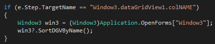
Step12 – colName including sorting
We highlight colNAME and in BeforeStep event handler we also sort the column:
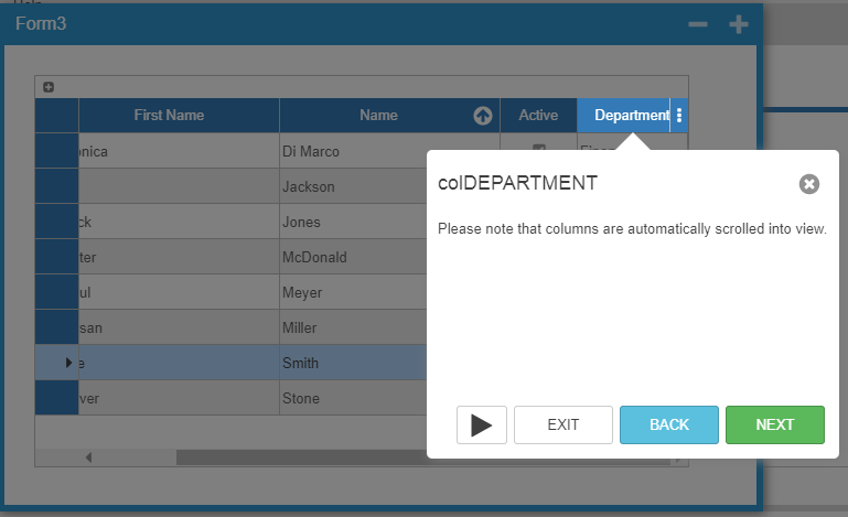
Step13 – colDEPARTMENT
The column scrolls into view automatically.
Step14 – Column Visibility Menu
Highlight the Column Visibility Menu with Window3.dataGridView1/column-button
Step15 – Tool to add new rows
Address the first tool button of a DataGridView with Window3.dataGridView1/tools[0]
Step16 – Label for Chrome
Here we show how to use the Tag property and Enable/Disable of a TourStep:
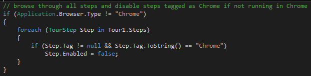
We loop through each TourStep and depending on the Browser.Type we enable/disable all steps that have been tagged with “Chrome”.
Step 17 – CKEditor
Wisej widgets can be highlighted just like regular controls.
Step18 – Checkbox on AccordionPanel
AccordionPanel is expanded automatically and checkbox is selected.
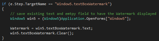
Step19 – Watermark
Shows how to use BeforeStep to make sure that the textbox is empty allowing the Watermark to show.
We preserve its value:
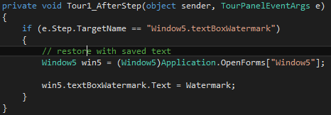
In AfterStep event handler we restore the Textbox value to the preserved text:
Conclusion
There are a lot more options with the TourPanel. Here are just a few pointers, you are invited to explore the TourPanel:
By attaching to the InvalidStep event you can handle TargetNames that cannot be resolved.
AllowPointerEvents let you block/allow the selection of entries of a combobox etc.
Using BeforeStep/AfterStep you can have a lot of different conditions / states for your TourPanel.
With the CurrentStep property you can get/set the current step allowing different orders or skipping steps.