The TextBox control in Wisej.NET is a wrapping of the HTML <input> element. While this is often used for text input, it can also be used for many other data types such as colors, dates, telephone numbers, and more. In this blog we explore the InputType property of the TextBox control and what we can do with it.
Creating a custom color picker in the browser can be done using a standard TextBox control with the InputType set to Color. When the user clicks on the TextBox control, a color palette pops up, and the user can select a color by clicking on it.
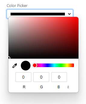
TextBox with InputType = Color
If you’d like to provide a preset list of colors, you can set the AutoComplete list of the TextBox control.
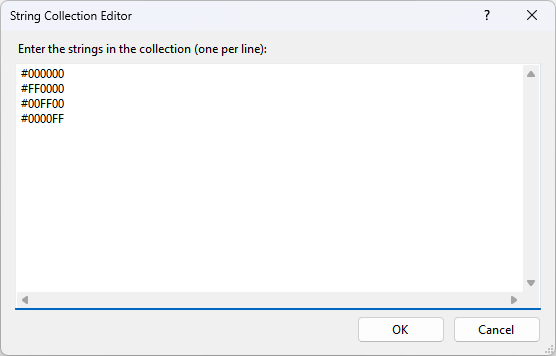
AutoCompleteList Editor
The resulting application shows the following editor on Chrome:
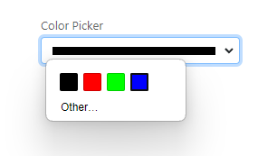
Custom Color Picker on Chrome
The view of the picker will vary depending on what browser you are using.
Another useful data type that can be handled with the InputType property of the TextBox control is time. By setting the InputType property to Time, the TextBox control can be used as a time picker.
The time picker in Wisej.NET works similarly to the color picker. When the user clicks on the TextBox control, a time picker pops up, and the user can select a time by clicking on the hour, minute, or second fields. The selected time is then displayed in the TextBox control in the format “HH:mm:ss.”
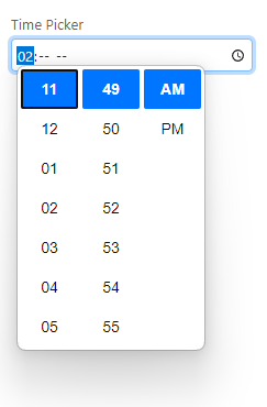
TextBox with InputType = Time
Similar to the example above, we can provide a list of times using the AutoCompleteList property of the TextBox control:
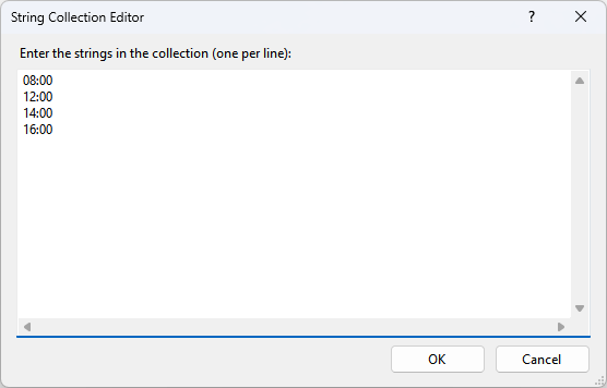
AutoCompleteList Editor
When the application is run, this is the result:
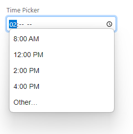 Custom Time Picker
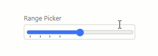
The InputType property of the TextBox control in Wisej.NET also supports a Range data type, which allows you to create a range picker. A range picker allows users to select a value from a specified range, such as a price range or a quantity range.
When the InputType property of the TextBox control is set to Range, the control displays a slider control that the user can drag to select a value. The selected value is then displayed in the TextBox control.
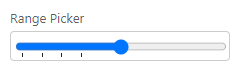
Custom Range Picker
In the screenshot above the ticks are only represented at the 0, 10, 20, and 30 marks. These tick values can be specified using the AutoCompleteList property.
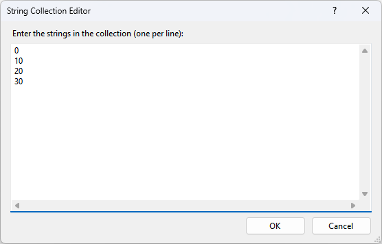
AutoCompleteList Editor
When moving the slider it will “snap” to the nearest tick. If it’s sliding over an area with no ticks, the sliding will be smooth.
Custom Range Picker Sliding
These are just a few of the pickers explored, but you can find a full list in the documentation:
https://docs.wisej.com/api/wisej.web/editors/wisej.web.textboxtype
If you want to read more about how the pickers work, see: https://developer.mozilla.org/en-US/docs/Web/HTML/Element/datalist