We have recently added several new controls to Wisej that I´d like to present here:
All our extensions are published with the full source code, allowing you to study the code or extend it to fit your needs, on GitHub.
We recommend to use the watch functionality in GitHub to stay up to date with all additions and updates.
We invite you to try our demos or test the controls in your code as most of the features are intuitive and easy to use. This blog article describes the core functionality of the controls but there is way more to explore.
All extensions will also be available on NuGet with the next release of Wisej and Wisej 2.
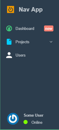
Similar to the Bootstrap Sidebar, the NavigationBar enables you to quickly add a modern, responsive navigation bar to your application. It includes a top logo, an optional user information panel at the bottom, and nested items that can show a quick action icon and a text bubble to display additional information related to the item.
A sample that shows some of the NavigationBars features can be downloaded from our website. (See links at the end of this article).
Include a reference to Wisej.Ext.NavigationBar and drop an instance of it from the toolbox on your container (window/page).

NavigationBar in compact view. Click on top button (logo) to toggle compact view mode. It can also be set as a property in the code.
When it´s extended from compact view, the NavigationBar can look like this:
Themeable colors for background and text.
UserAvatar/UserName/UserStatus/UserStatusColor ShowUser are used to control the user info part in the navbar. ShowUser hides/shows the complete section.
There is even a method that automatically retrieves a user Gravatar from the email address. Unsurprisingly named NavigationBar.GetGravatarUrl(email).
ItemClick is fired for a click on one of the items in the NavigationBar, e.Item contains the item that has been clicked.
The actual content of the NavigationBar are the NavigationBarItems. Items can have subitems so you can build a nested hierarchy of controls. Each item can have an Icon, InfoText, InfoTextBackColor, InfoTextForeColor etc.
Note
To compile this extension you need Visual Studio 2017 or to install the latest C# compiler here.
Another new control is included in the same sample as the NavigationBar:
The side button is a useful control that is also quite common in modern web applications. It adds a small button elastic button to a container. It can be docked to the left or the right and expand in the opposite direction (similar to the GMail options vertical bar):
It has a collapsed property that is used in the sample to show/hide a FlexLayoutPanel.
This FlexLayout can contain any kind of elements, in this sample it just hosts 2 picture boxes.
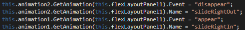
We also dropped 2 animation extenders on the page so we are able to define sliding effects when the panel is shown/hidden:
Here we have another powerful new control that helps to dynamically arrange its child controls.
Its usage can be tested with the TagInput sample (download / test links see at the end of this article).
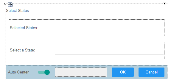
You can find multiple nested FlexLayoutPanels here.
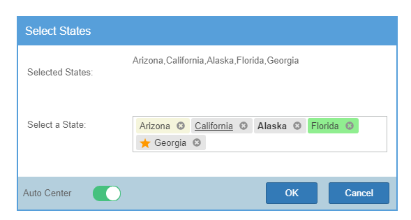
The first inner FlexLayoutPanel contains 2 labels (“Selected States:” and a 2nd label that displays the states that are selected in the TagInput at runtime.
Its AutoSizeMode is set to GrowAndShrink as well as the AutoSizeMode of the outer FlexLayoutPanel. So the more States you select the bigger both get. When you deselect them from the TagInput both panels shrink again.
The second inner FlexLayoutPanel contains a label and the TagInput control:
The sample also demonstrates the handling of various events:
AlertBoxes are shown for Added/Removed/Selected/Rejected tags.
Whenever the TextChanged event fires, the label is updated showing the content as text considering the SeparatorChar property.
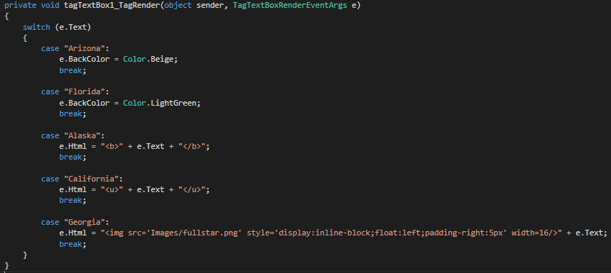
The different rendering of the tags that you are seeing in the sample is defined in the TagRender event handler:
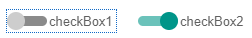
This is not really a new control but it appears like one:
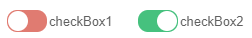
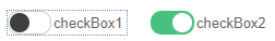
For checkboxes we added a new appearance called “Switch”. Of course this appearance is also themeable, so you can change all visual aspects by selecting a theme or creating a custom theme or mixin. All checkboxes still behave like standard checkboxes and can be used in data binding etc.
Switch in Blue-1
Switch in Clear-1
Switch in Material-3