Starting with Wisej.NET 3.5, a new Premium Extension, MobiScroll, will be available for developers to use in their projects. The new extension will allow Wisej.NET developers to build mobile-friendly and responsive applications using a number of new controls and components.
Advanced select component for single and multiple value selection. Provides a great alternative to the native dropdown with enhanced UX. Renders a scroller on touch and a dropdown on desktop.
The Select component can be added from the Toolbox or programmatically using the following:
var select1 = new Wisej.Web.Ext.MobiScroll.Select();

// attach to an existing TextBox control.
select1.Control = this.textBoxSelect;

// provide the options.
select1.Options.showGroupWheel = true;
select1.Options.data = new dynamic[] {
  new { text = "United Kingdom", value = "GB" },
  new { text = "France", value = "FR", group = "Europe" },
  new { text = "Hungary", value = "HU", group = "Europe" },
  new { text = "United States of America", value = "US", group = "America" },
};
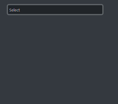
Select Component on Windows

Select Component on iOS
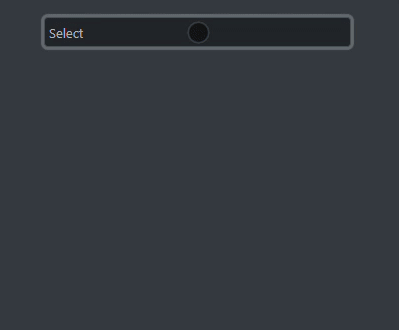
Anchored Select Component on iOS
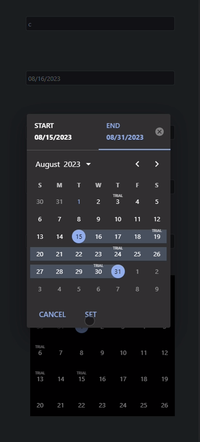
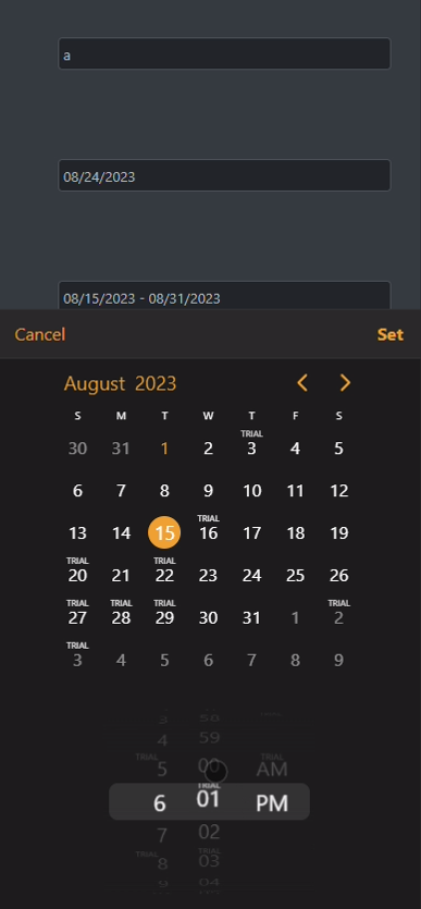
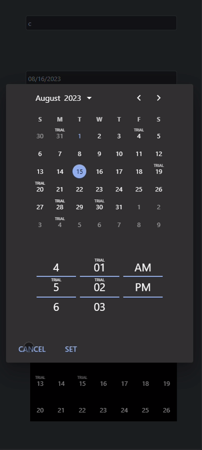
Let’s look at a date picker. For example, the range picker supports start & end selection for date, time and combined date & time. Choose between a calendar view with one or more months, week view with single or multiple weeks or date and time scrollers and dropdowns.
The DatePicker component can be added from the Toolbox or programmatically using the following:
var datePicker1 = new Wisej.Web.Ext.MobiScroll.DatePicker();
datePicker1.Options.select = "range";

// attach to an existing TextBox control.
datePicker1.Control = this.textBoxSelect;
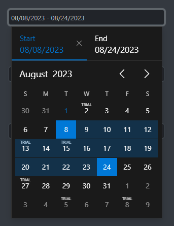
Range Picker on Windows
Range Picker on iOS
Range Picker on Android
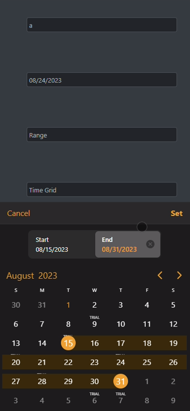
The date picker ships with five built-in variations for rendering the UI. The controls option supports the following:
Use controls: [‘datetime’] for rendering a date & time picker within the same control, tied to the same input, or use them separately for two inputs – controls: [‘date’] and controls: [‘time’]. It will render a scrollers for touchUi: true and a dropdowns for touchUi: false.
The DatePicker component can be added from the Toolbox or programmatically using the following:
var datePicker1 = new Wisej.Web.Ext.MobiScroll.DatePicker();
datePicker1.Options.controls = new[] { "date", "time" };
// attach to an existing TextBox control.
datePicker1.Control = this.textBoxSelect;
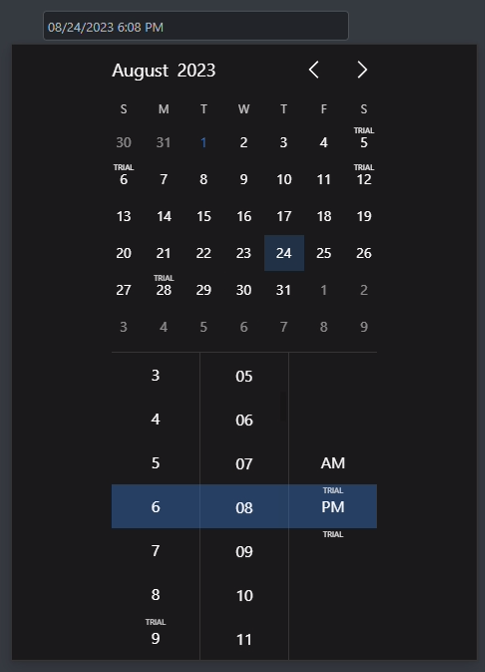
DateTimePicker on Windows
DateTimePicker on iOS
DateTimePicker on Android
The theme for each control can be set in the Options property:
this.select1.Options.theme = "ios";
this.select1.Options.themeVariant = "light";
Attaching to events works the same way as any other premium extension:
this.select1.Instance.onChange += new WidgetEventHandler(select1_onChange);
...
private void select1_onChange(object sender, WidgetEventArgs e)
{
    AlertBox.Show(e.Data.ToJSON(true));
}
Please note that the Wisej.NET Premium Extension will require a commercial license from MobiScroll that can be purchased directly from their website.