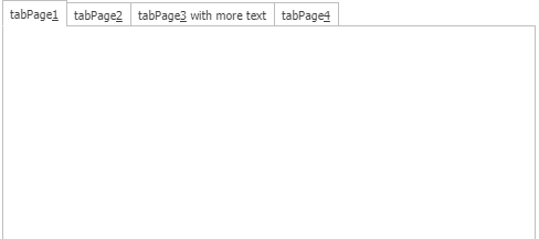
Extended TabControl in Wisej
Most developers should be well familiar with the TabControl that is present in almost every application and used to group information in a compact view.
In Wisej we support 100% of the functionality that is present in WinForms including all properties, events and methods.
But there´s even more in it. An interesting feature that you may have been missing is the option to easily rearrange the tab pages at runtime. Here is where the property AllowUserToMoveTabs comes in quite handy.
Once set to true the user can move the tabs by dragging them just like you can do with Chrome’s tabs.
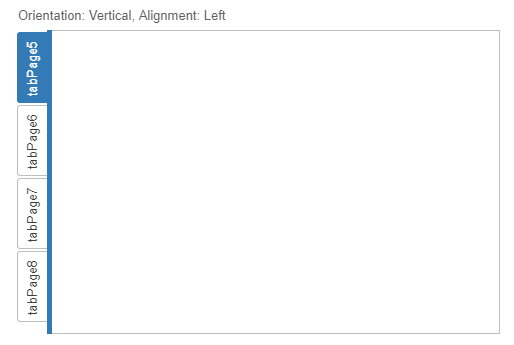
Using Wisej you are also not just limited to horizontal tabs. By changing the Orientation property you ca also use vertical tabs:
When it comes to dynamic tabs, the functionality in WinForms is rather limited. Beside destroying and recreating tab pages there is not much control over the pages in a Windows TabControl. Depending on the number of controls on those pages, this can be quite a heavy operation.
In Wisej there is an additional property to hide/show any TabPage by simple setting its Hidden property to true / false. Quite easy, right ?
While the TabControl can have its page headers adjust their size to their text content, the overall TabControl’s header often doesn’t use the space that is available on the parent container.
That´s where the TabSizeMode can kick in:
Normal: reflects the common appearance.
![]()
Fill: The complete width (or height for vertically oriented Tab Controls) is used
![]()
Center: The page headers are centered on the Tab Control
![]()
Fixed: All page headers have the same size (ItemSize property).
![]()
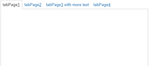
Furthermore the Wisej TabControl supports Mnemonics, i.e. you can add & in front of the character of the text to use as a shortcut key. Pressing ALT+[Mnemonic] from anywhere on the page will select the specific TabPage.
The last feature I´d like to present is not limited to the TabControl but a rather powerful mechanism built inside Wisej: Theming. Find more information here: https://wisej.com/docs/2.0/html/Themes.htm
With Theming you can control the appearance of your application in a central place guaranteeing a consistent display style all over your application(s).
Of course you can also use this to setup the look and feel of your TabControls.
Here are a few aspects you (or your graphic designer) can modify with the Theme Builder, considering the current state of the widget (disabled/focused/hovered/etc.)
This is all to be done in the section „TabView“
– Browse Buttons (backward/forward)
– Focus Frame
– Buttons
– Labels
– Icons
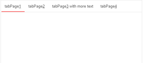
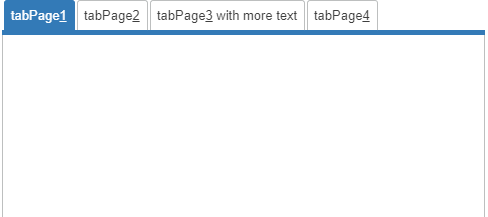
In my sample I have added a Theme Selector ComboBox so you can see the different appearances of the TabControl in our prebuilt themes.
Material
Blue
Clear
Classic
